
 |
| Vivi-Mari Carpelan: "Primordial Chaos II", from experiments with ink at art college, 1994 |
 |
| Vivi-Mari Carpelan: "X - Surviving in the World of the Fitter" |
I'm not going to tear down the whole Saatchi emporium just because I didn't make it through the first voting round, but I will talk a bit about it because participating in it made me think about what it really is about and whether it works as a "phenomenon". Okay, well I will probably have to admit to some driving force behind the failure... yet I will try and be objective about it all nonetheless. The first thing to realize is that getting further into the competition is the result of pure chance. This is also my main objection! What is the point with a competition which is really in the hands of a fickle and totally random audience who sees your artwork on the screen on a minimal scale of about 3x5 cm? And of course, it's all set up so people won't be viewing the pieces for more than a couple of seconds if even that. It's like Martin put it, people are almost like subjects of some research where they are put in a dark room only to press a yes or no button as quickly as images pass them by, ten per second or so...
What I found on closer inspection was that I had many more views and likes than most of the pieces that ended up amongst the 300 that made it through the preliminary voting round! I was also trying to be nice and interactive by voting for others, but in reality the votes cast probably ended up counting against myself. I wonder who actually participates in the voting if it's not the participants themselves? I know I had quite a few votes but apparently not enough. What also worries me is that unassuming people see the paired up artworks which are being put up against each other, and click on the more complex one in order to see it better. This would take them away from the voting site altogether, unable to return to the piece they liked! At least when I did this, I was not able to vote for the artwork I was looking at because some other random pair came up instead. This hypothetical behaviour amongst the audience might very well have been the case with my piece, which was intricate and probably made people want to see it on a bigger scale.
On the other hand people who are voting are hardly looking for meaning, only whatever is instantly attractive to them. These are usually rather simple compositions with striking colours. This would be especially true for the collages. And who wants meaning anyway? All it does is it creates more brain work!
I was hoping that my collage would attract attention for its contents, especially as the main member of the jury, Wangechi Mutu, seemed like someone who might take an interest in social and political statements. "Her paintings and collages often feature writhing female forms, their skin an eruption of buboes, mutant appendices like gun shafts or machine gears sprouting from the sockets of joints, their bodies half human, half hyena. They offer a glimpse at the perversions of the body and the mind wrought by forces active in the oppression of women." (from the artist's statement at the Victoria Miro Gallery website). The images are very beautiful, so I will divert a bit from the subject here by presenting a couple of her pieces:
My only possible critique might be that there sometimes seems to be more in her words about the oppression of women than I am able to perceive in her art. There is always a problem with the tension between representation and interpretation, especially when it's subjective. If anything, often times the beauty of her expression suggests things far less socially corruptive than her feminist view seems to imply!
In fact I did similar experiments with ink and plastic film at art college but never took it further, yet it's something that has been on my mind ever since... now I have regrets! Well once I have a new scanner and ink jet printer things should take a turn... it has been hard to experiment with anything due to a lack of space, well my studio is not big but at least it's a studio and not just the corner of a bedroom! On the other hand I have to admit that I want to avoid using a lot of plastic and this would probably be another "criticism" of Wangechi's work.
 |
| Wangechi Mutu: "Intertwined", 2003 (collage and watercolour) |
 |
| Wangechi Mutu: untitled The Artist says (on the Saatchi Gallery website): “Females carry the marks, language and nuances of their culture more than the male. Anything that is desired or despised is always placed on the female body.”  Wangechi Mutu: "Blacklash Blues" 2004 (mixed media collage) I recommend looking at pictures and reading more here! |
In fact I did similar experiments with ink and plastic film at art college but never took it further, yet it's something that has been on my mind ever since... now I have regrets! Well once I have a new scanner and ink jet printer things should take a turn... it has been hard to experiment with anything due to a lack of space, well my studio is not big but at least it's a studio and not just the corner of a bedroom! On the other hand I have to admit that I want to avoid using a lot of plastic and this would probably be another "criticism" of Wangechi's work.
 |
| Vivi-Mari Carpelan: "Primordial Chaos I", from experiments with ink at art college 1994 |
Back to the Saatchi showdown; of course I never got as far as being seen by a proper judge and art critic... instead my piece was in the hands of a very random selection of disinterested voters... I don't know if I have misread the instructions but it sounded to me as if I cannot enter any other competitions on Saatchi once I have submitted one piece to one showdown. What's that all about?!
Another objection I have is that this particular competition but probably many others too, don't make a distinction between digital and handmade collages. Digital collages are created on a small computer screen and the colours tend to be quite vivid. Very often people borrow other people's photographs in doing this, which of course is especially objectionable. It's easy enough to create a flashy digital image, but how often do we see anything with any meaning attached to it? The digital image will obviously seem very attractive to people who are viewing it on their own computer screen. I really don't think this is a fair game.
Handmade collages often have a lot of other things going for them, for instance texture and meaning, but very often this is not that easily conveyed on a computer screen (which is backlit). It gets even worse when the collage is too big to be scanned (unless you pay a lot of money for that of course). I did see some appalling examples of badly photographed collages. I did my best with my Nikon D90 but in the winter the light is bad. I did two attempts, the second caption was incredibly poor. I had in fact forgotten that we do have a floodlight, when we bought it for our wedding I said I would use it for photography and so it was a good investment. Martin has taken it to the workshop for storage where he works sometimes, and I forgot all about it! It will surely help matters a great deal.
By the end of the day, I believe that the art work that receives attention in exhibitions are not the digitally constructed ones (it's not very easy or cheap to make decent print outs that have the same vividness about them), but the intricate and complex ones that people can get lost in. I am personally starting to see more reasons for doing real exhibitions and also for visiting them rather than restricting my perception by looking at a lot of art on the internet.
Before the Saatchi competition for collages, there was one for drawings. I did follow that a bit and there were certainly many attractive drawings on show. I was very disappointed with the winning pieces though. They were boring and minimalist, totally devoid of any meaning whatsoever. I was complaining to Martin, suggesting that "only empty, minimalist and boring artwork seems to be appreciated" His answer was, "... or only empty, minimalist and boring work seems to be understood ...!".
This is indeed a very depressing prospect. Martin thinks that minimalism is on its way out. I can understand that the British are still entranced by functionalism and the minimalism that tends to go with it, since modernism has never really been a very strong style in a very conventional country where most people grew up in claustrophobic Victorian terrassed houses. One would think people would be good at creating the exact opposite to the complex language of forms that they are used to, but I don't see much evidence of this ever really working out here in the UK. I was thinking that maybe this was the secret to my success in the 1990s - I made opulent work that was something a lot of people in minimalist Finland were really craving for deep inside.
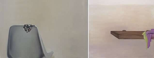
I remember the artists that were sought after in Finland in those days, they were very often rather badly drawn and painted figures of animals or stones surrounded by messy brush strokes in really dismal and depressing colours... Here is a collection of Finnish artists who have been popular between 1980 and 2006. When will the muddy colours give way for something a little less dismal and simplistic? I have seen the same preference for such colour schemes here in Wales and Martin who has seen more Welsh art than I says it really looks very similar. Muddy colours don't equal depth and meaning! And what's up with the repetitive compulsion for such static compositions, where there is often just one element, drawn as a side elevations? This suggests a rather conventional perspective. Anything to do with the climate...? Haha (the climate is what people always blame everything for but you would think people longed for colour in a grey climate!).
I remember the artists that were sought after in Finland in those days, they were very often rather badly drawn and painted figures of animals or stones surrounded by messy brush strokes in really dismal and depressing colours... Here is a collection of Finnish artists who have been popular between 1980 and 2006. When will the muddy colours give way for something a little less dismal and simplistic? I have seen the same preference for such colour schemes here in Wales and Martin who has seen more Welsh art than I says it really looks very similar. Muddy colours don't equal depth and meaning! And what's up with the repetitive compulsion for such static compositions, where there is often just one element, drawn as a side elevations? This suggests a rather conventional perspective. Anything to do with the climate...? Haha (the climate is what people always blame everything for but you would think people longed for colour in a grey climate!).
 |
Leena Luostarinen "Tiger", 1980 Kimmo Kaivanto - unfortunately I don't have a date  Ulla Rantanen, "Brief Life" 2006  Ulla Rantanen "Rock in the Water", 1980  |
Susanne Gottberg - I don't have a date, as far as I remember she came into fashion in about 2000
Nina Roos, "Positions and Reversals", "Not Yet Said Not Yet Done" 2007-2008
The artist was rewarded with the Carnegie Art Reward in 2004

Kuutti Lavonen, "Rafael" 2004
No comments:
Post a Comment